

Everydrop
BRANDING / PRODUCT DESIGN / IN-APP ILLUSTRATION
THE CHALLENGE:
New parents are overwhelmed.
The goal while creating Everydrop was to translate clinical tracking data (feeding logs, symptoms) into a visual language that felt supportive, not stressful.
Early user research surfaced two conflicting needs: parents wanted calm, judgment‑free guidance that felt emotionally validating, while the business needed clear, scannable UX that increases onboarding completion and daily logging to drive retention.
THE APPROACH:
Balance 'medical credibility' with 'emotional warmth' to create a friction-free experience for exhausted users.
We built an expressive brand language using dynamic colors, loose lines, and gentle textures to convey empathy, then constrained it with a utility grid, accessible contrast, and typographic hierarchy for clinical clarity.
Everydrop was born, and became an app supporting new parents with evidence‑based guidance, symptom tracking, and feeding logs.
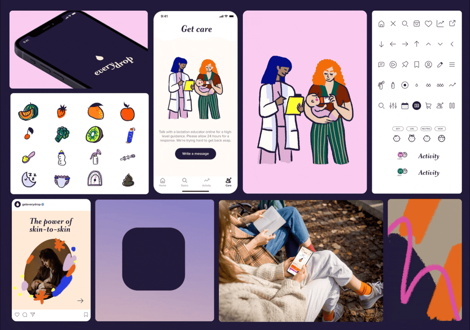

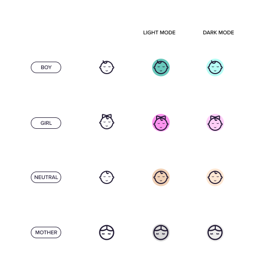
ICONS
A scalable iconography system designed for cognitive ease. We used organic shapes and soft edges to reduce visual noise, ensuring the interface feels calming even during 3 AM logging sessions.


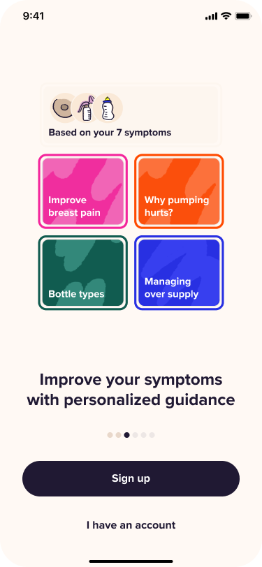
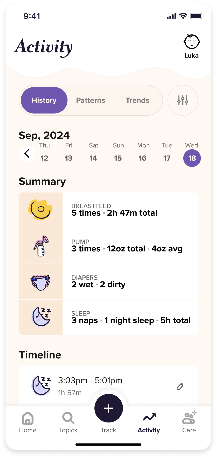
UX DIRECTION
The user experience is aimed at reducing friction. We included large touch targets and high-contrast active states ensure usability for one-handed interactions while holding a baby.


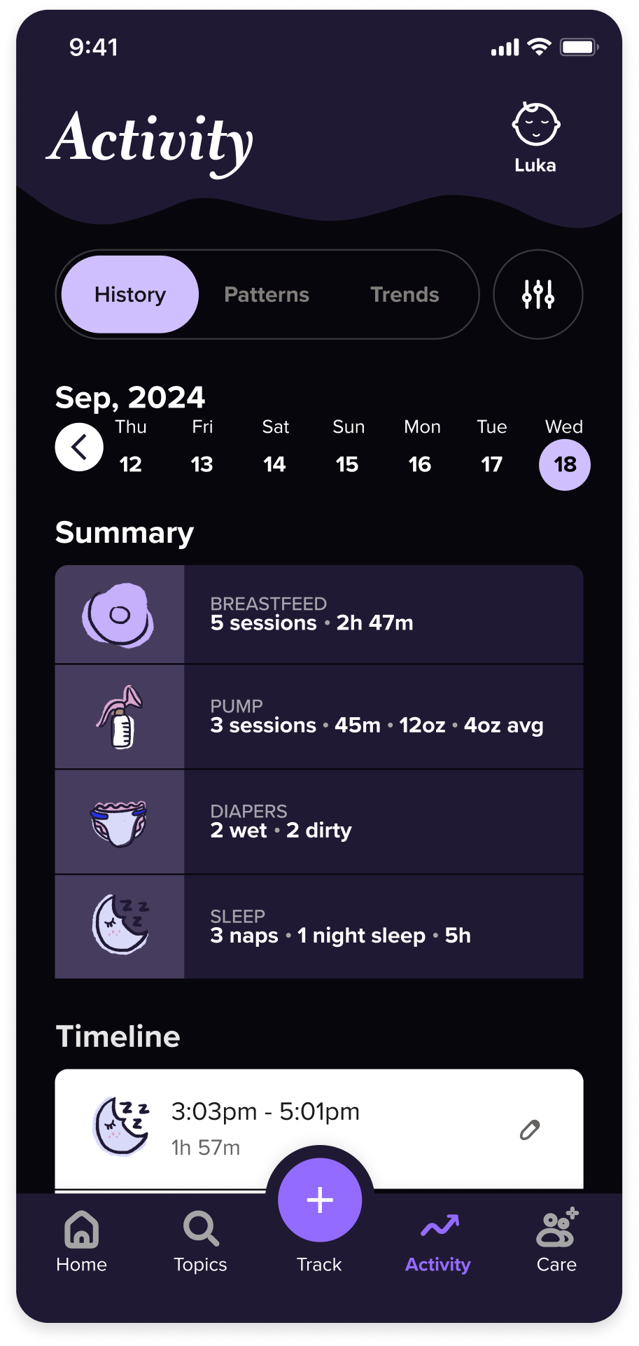
DARK MODE
For new parents, the 'use case' is often a dark room at 3 AM. We prioritized a dedicated Dark Mode to minimize blue light exposure and screen glare. This critical feature allows parents to log feedings without disrupting their own sleep cycles or waking the baby with a bright screen. We knew that a blinding white screen during a middle-of-the-night feed adds unnecessary stress. We designed a low-light interface that reduces eye strain and preserves the room’s atmosphere, ensuring that tracking essential data feels supportive rather than intrusive.
Essential for the 3 AM struggle. We designed a low-light UI to protect parents' eyes and prevent screen glare from waking the baby during night feeds.
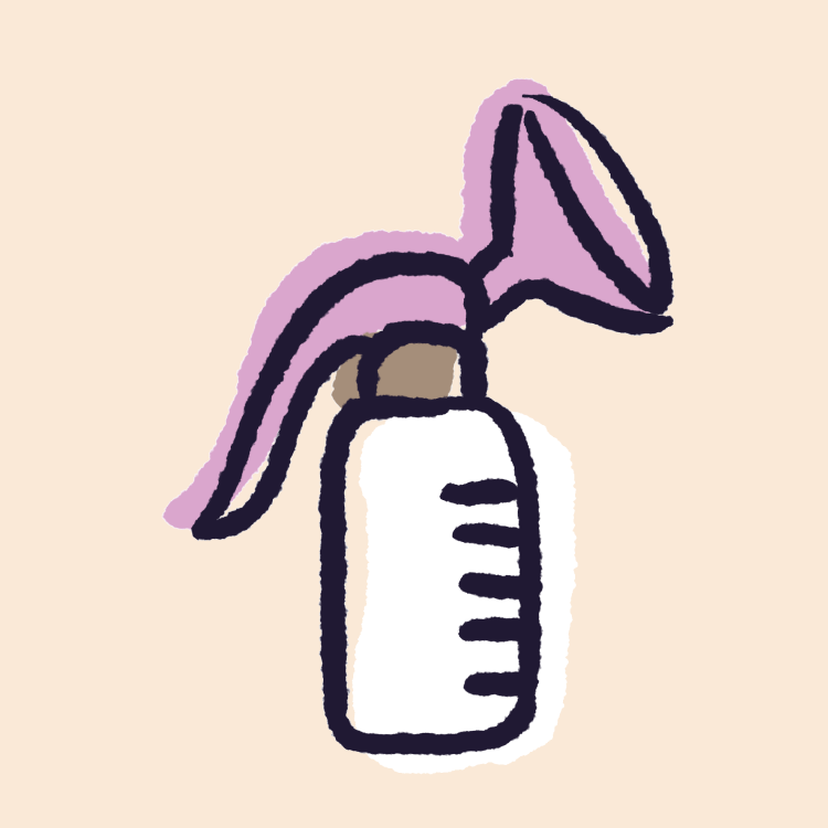
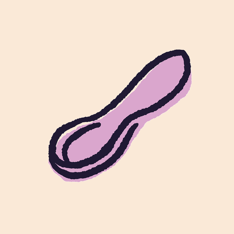
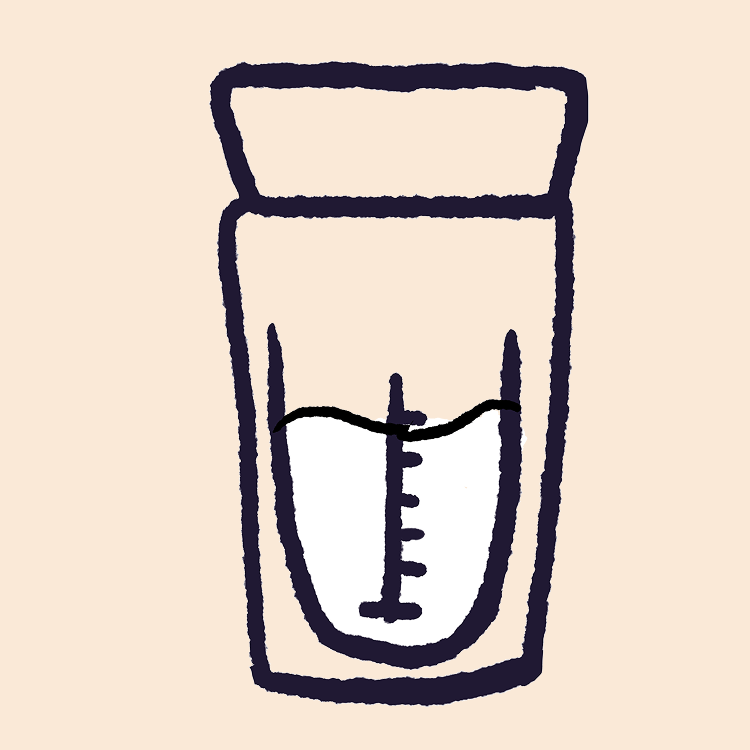
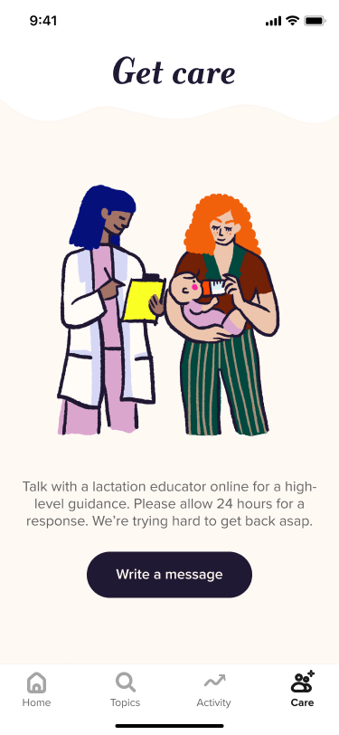
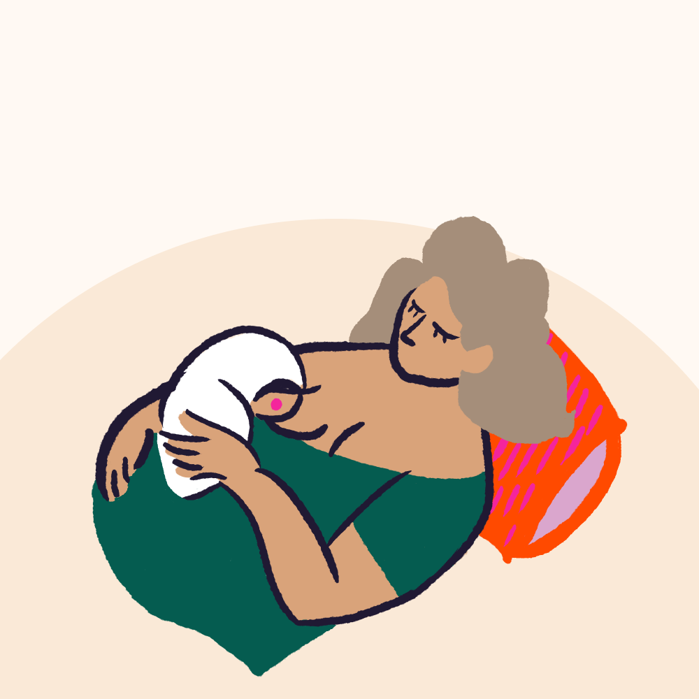
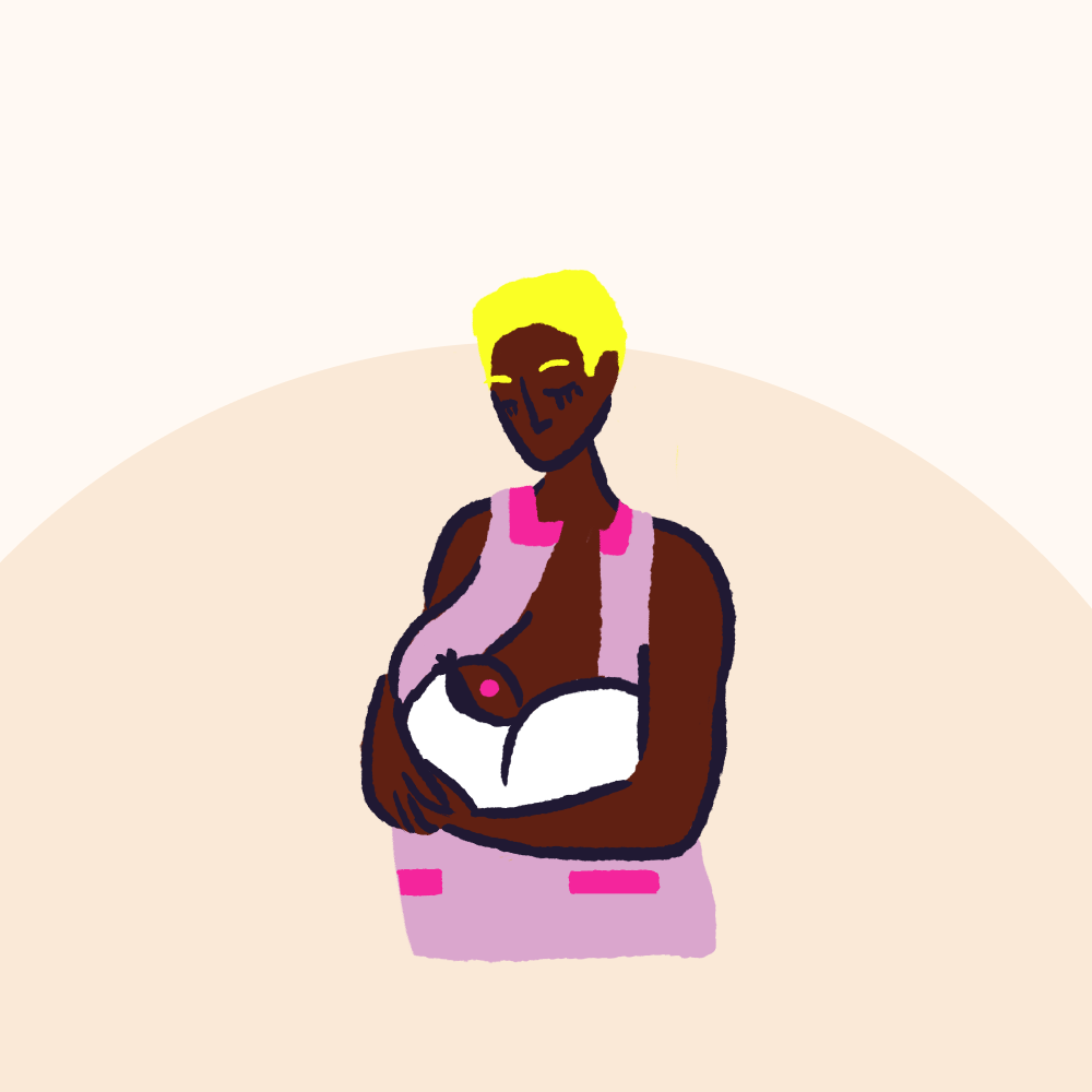
IN-APP ILLUSTRATIONS
Visualizing complex techniques (like latching positions) requires clarity without feeling sterile. This illustration library bridges the gap between 'medical diagram' and 'human connection.


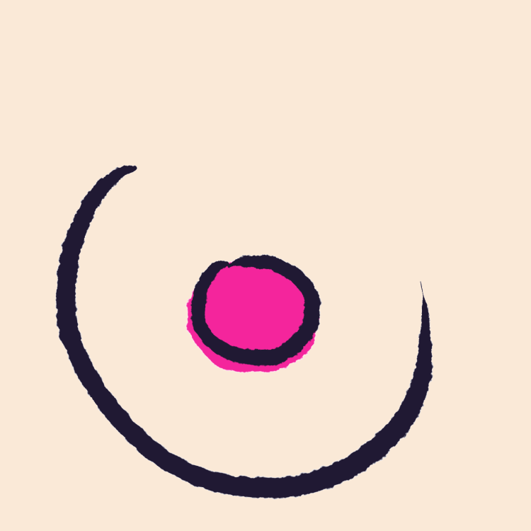
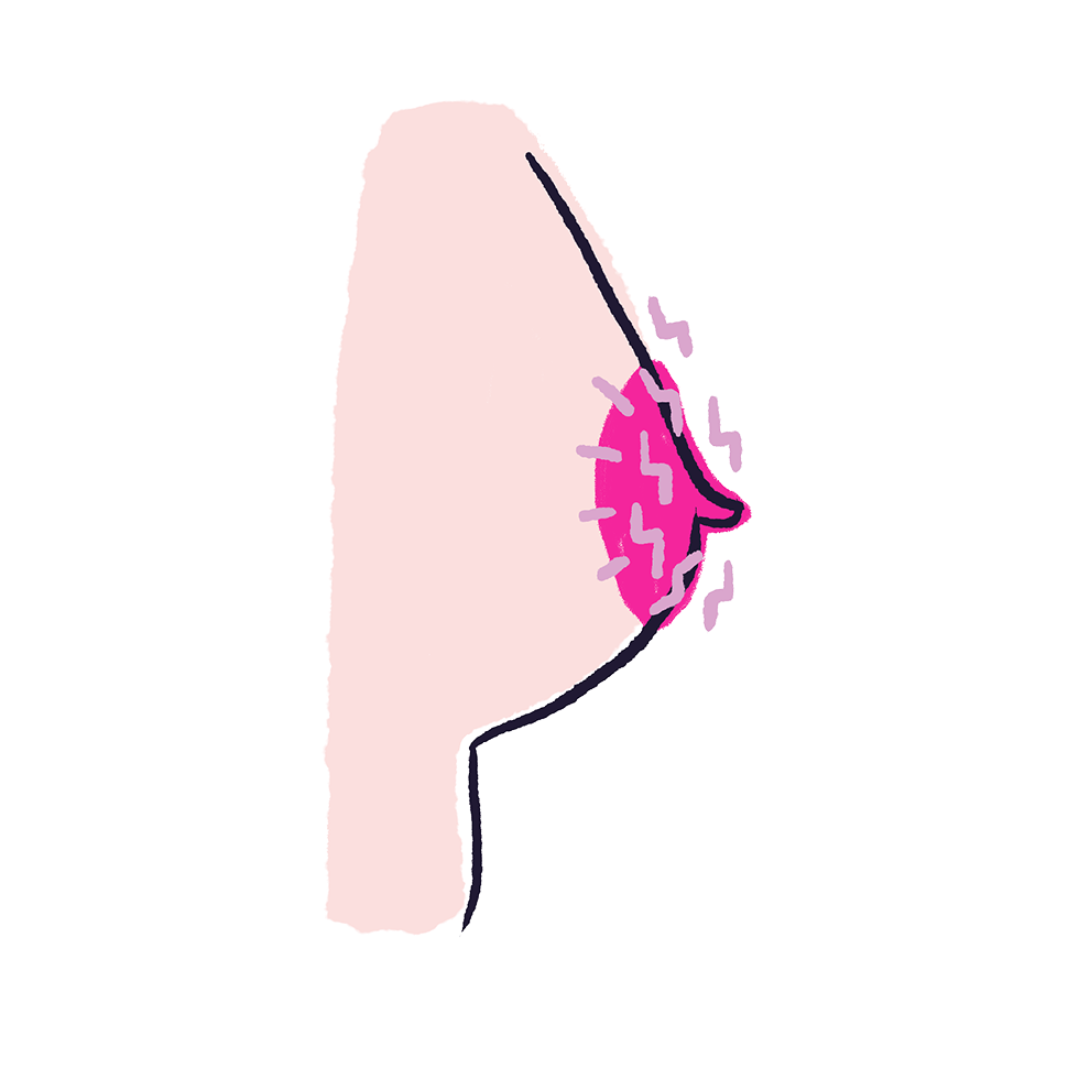
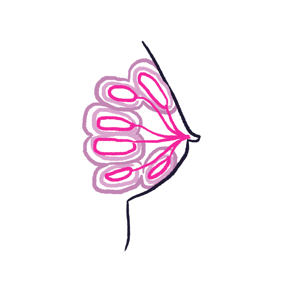
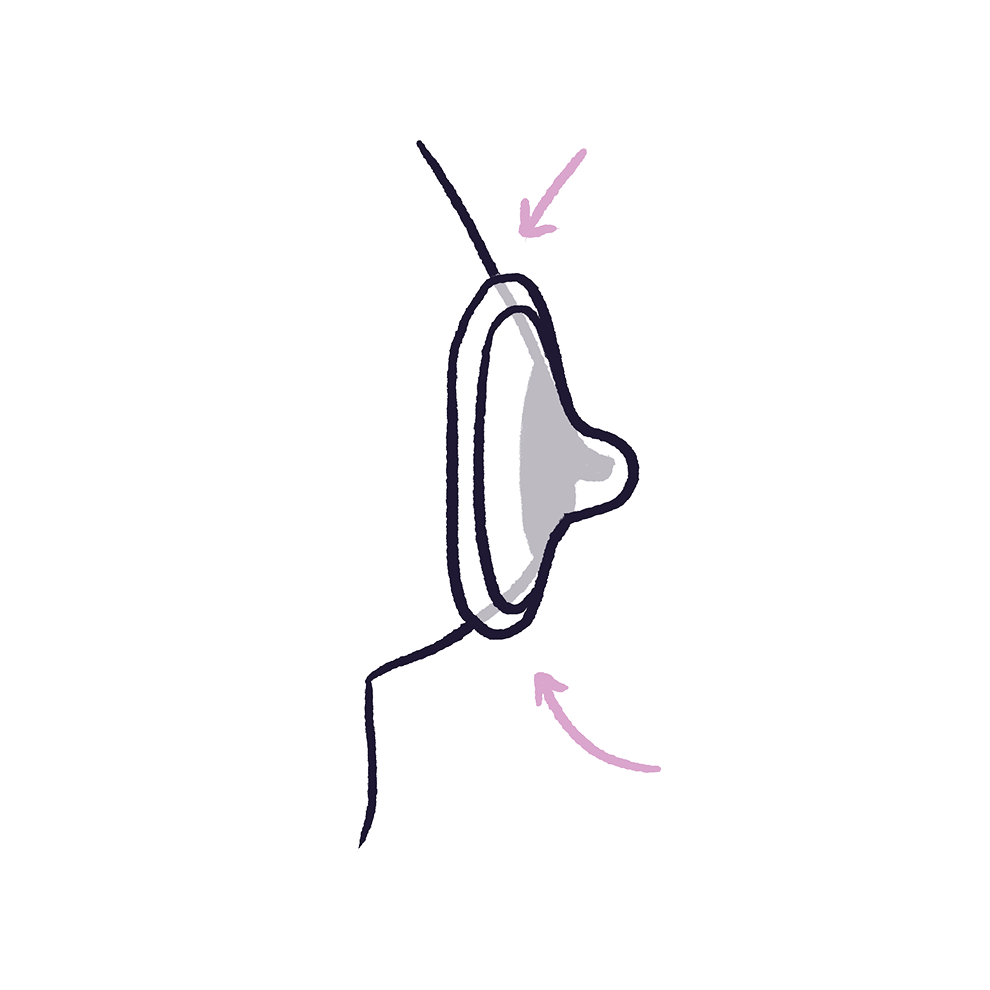
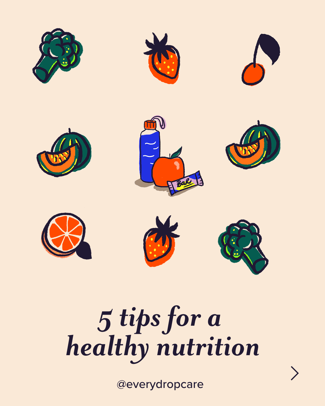
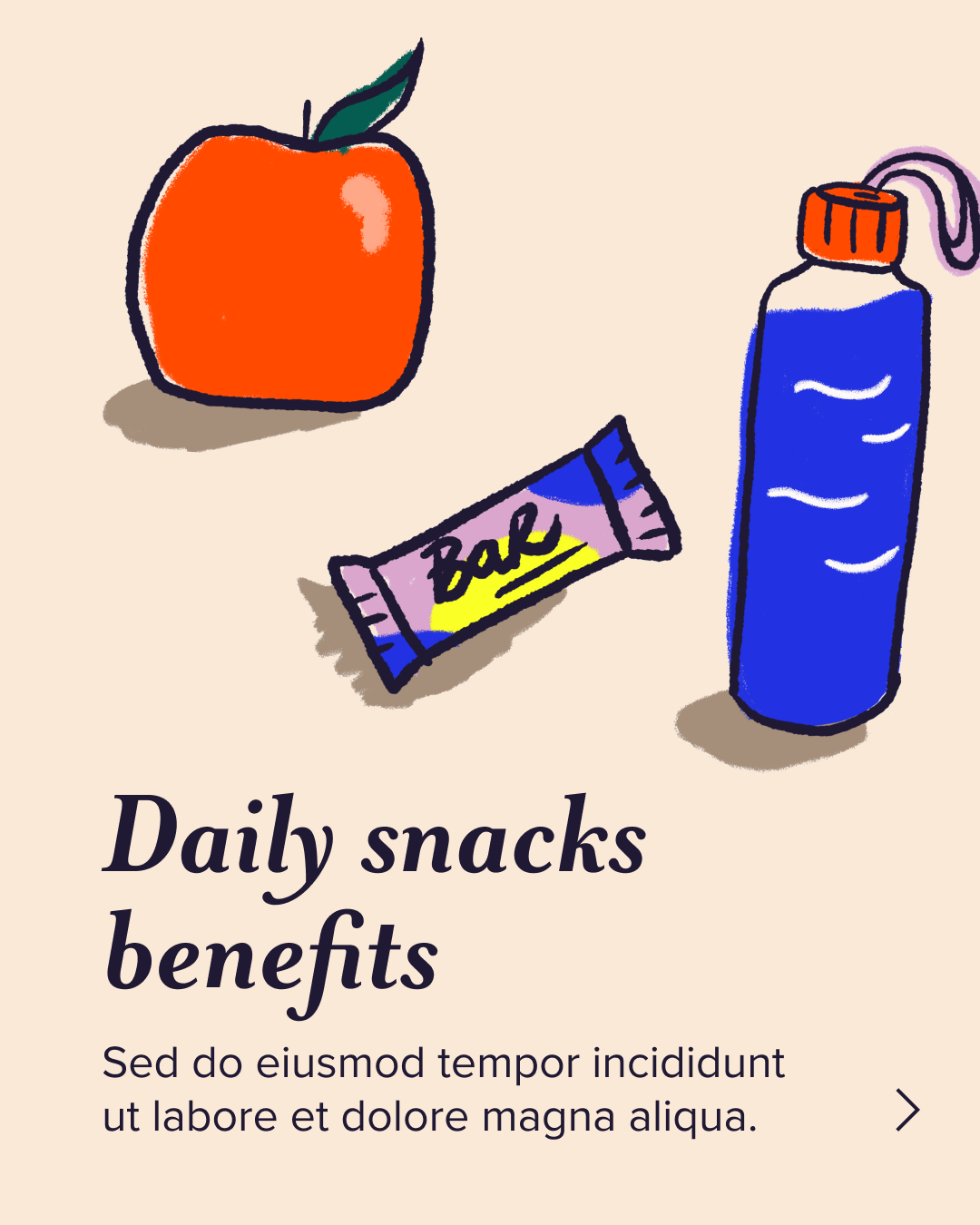
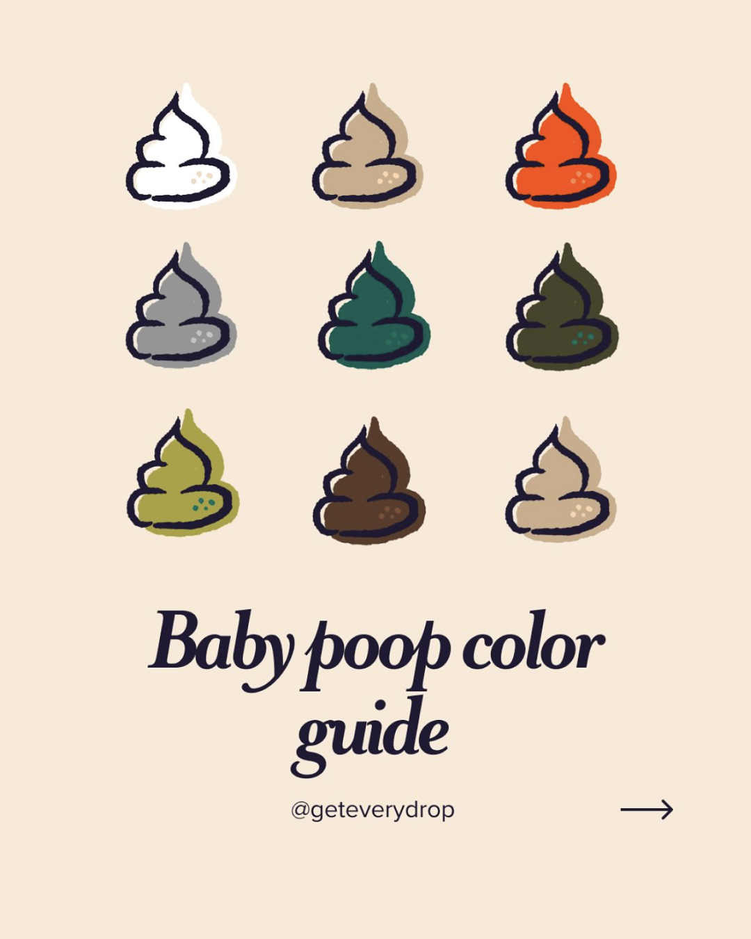
DATA VISUALIZATION & SOCIAL
We evolved the social content @geteverydrop from simple engagement into a trusted educational resource. I built a scalable visual framework designed to demystify complex lactation science and health metrics, turning them into digestible, bite-sized guides. This system allows the brand to rapidly produce evidence-based content that empowers parents to learn, troubleshoot, and feel confident in their decisions.


BRAND FOUNDATION
During the branding development stage, we moved away from the standard 'tech blue' used in medical apps, opting instead for a warm, earthy palette that grounded the user experience in wellness rather than pathology.


CREDITS:
Client Everydrop Care
Art Direction Idil Gözde
Illustration & Design Idil Gözde
DISTRIBUTION:
Apple App download